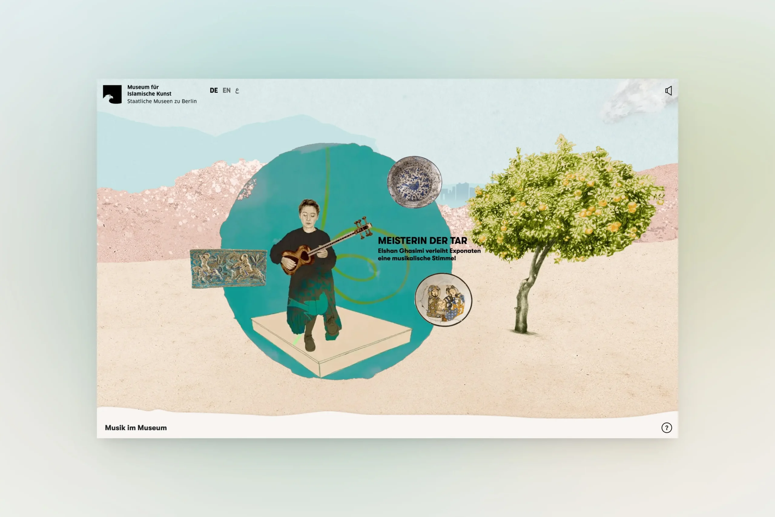
Beyond Closed Doors — A Museum Collection, Digitally Reopened
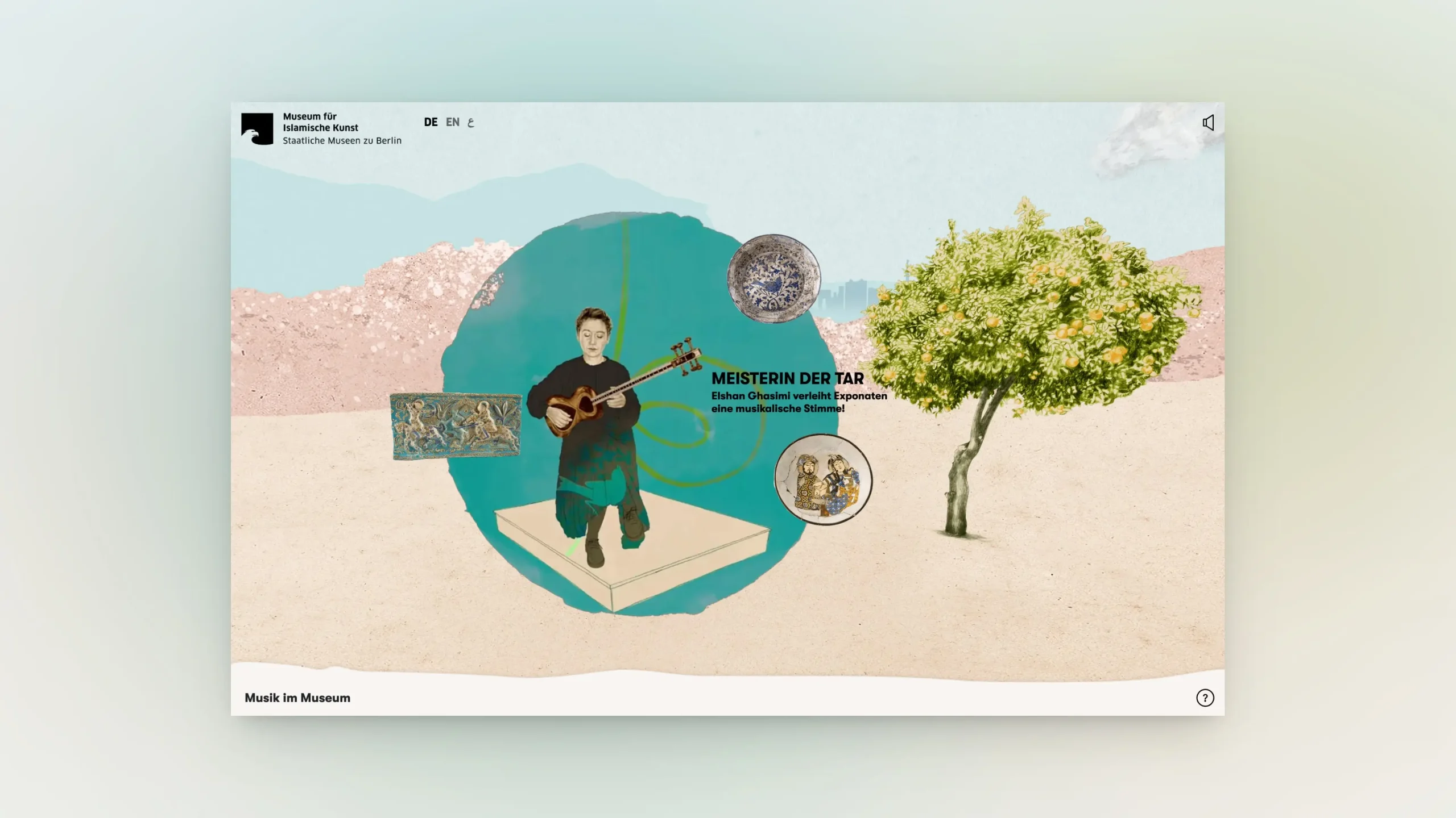
Project Type
360° Virtual Tour
Client
Museum für Islamische Kunst, Berlin
via Polyvista
Year
2022
Role
UX/UI Design and Concept — commissioned by Polyvista
When the Museum für Islamische Kunst in Berlin closed for renovation, its collections became inaccessible to the public for years. The challenge was to keep the museum present and its knowledge alive — not through a digital replica of its physical spaces, but through a new kind of experience designed specifically for the online medium.
01 — Challenge
Beyond the Physical Room
Designing a digital museum experience raises fundamental questions. How do you create a sense of space without replicating physical rooms? How do you guide a visitor through a virtual environment — establishing orientation, enabling movement from one space to the next, and maintaining narrative coherence throughout?
The content layer added further complexity. Individual artefacts needed to be presented in context — not as catalogue entries, but as part of a larger story. The experience had to be engaging and accessible, with key information communicable in under five minutes, while still offering depth for those who wanted to go further.
An additional requirement shaped the entire approach: the concept had to function as a blueprint — a reusable framework that could serve as the foundation for any number of future tours, each with its own theme and visual language.
02 — Approach
From Orientation to Discovery
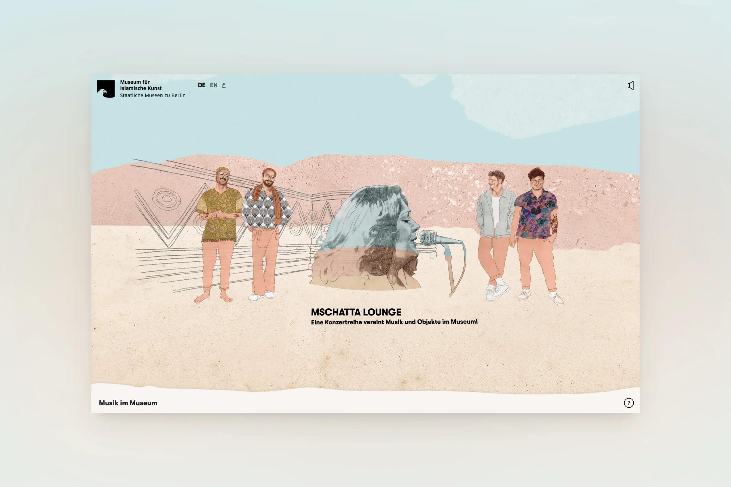
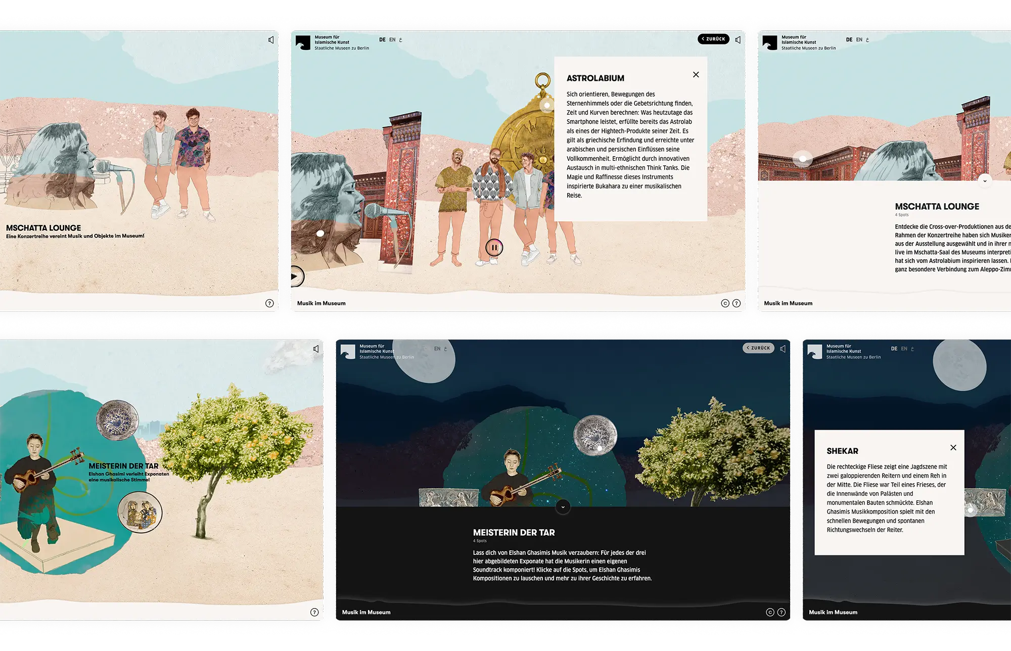
The first layer is a 360° panoramic environment — the visitor stands at the centre, with no fixed start or end point, moving left or right to discover the different thematic entry points. Scene titles and subtitles provide orientation within the space, making the structure legible without imposing a fixed path.
Each scene is a visual collage — a distinct motif developed by illustrator Birgit Lang, commissioned by Polyvista. The illustrative language can vary from tour to tour, while the underlying interaction model remains consistent. Some artefacts include subtle animations within the illustrations, adding a layer of life to the environment without distracting from the content.
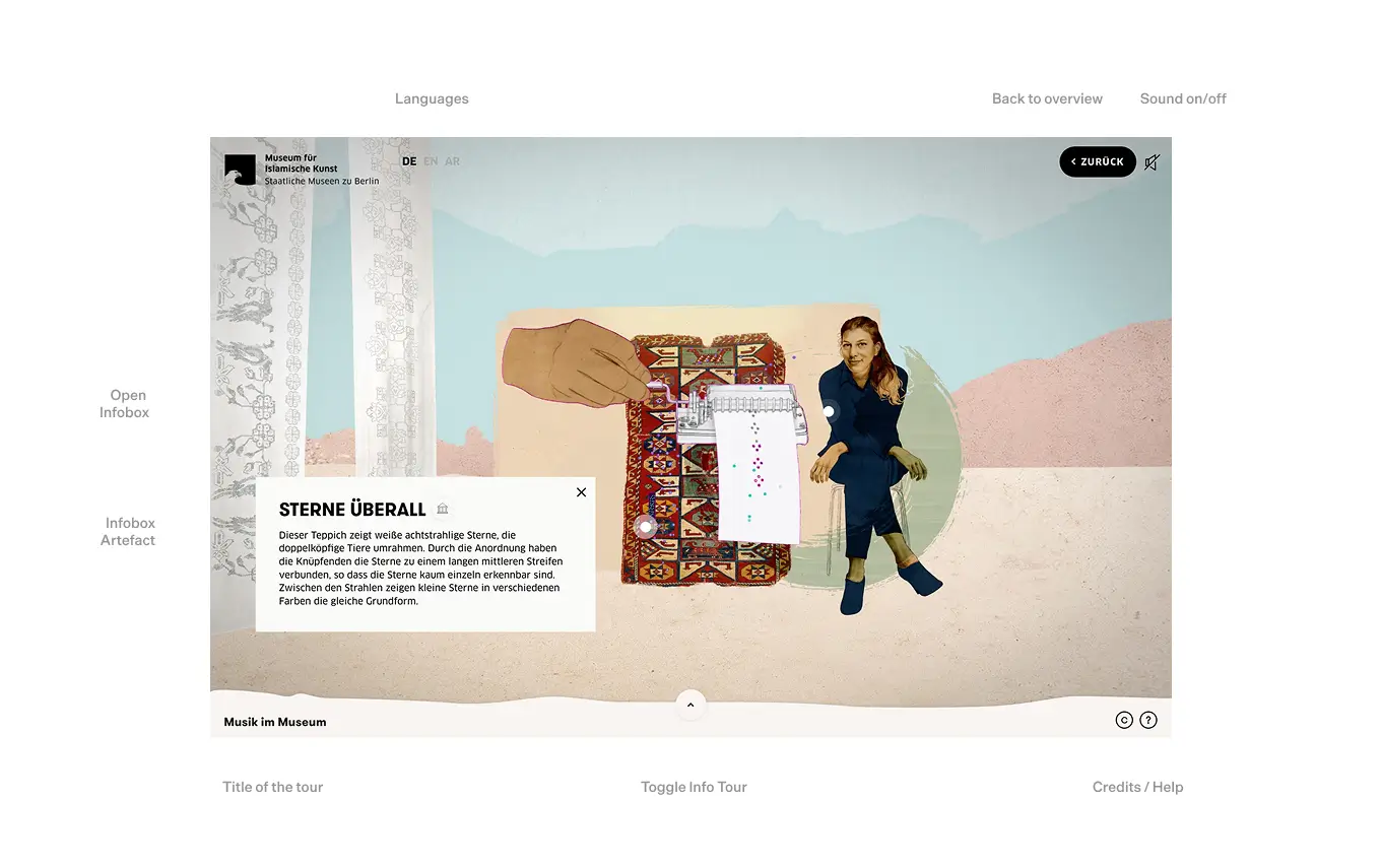
Clicking an entry point moves the visitor into the artefact scene — a more contained, focused view that mirrors the original scene with subtle visual shifts. Interactive elements are made visible through pulsing dots and media player icons, signalling the presence of text, image, video, or audio content without cluttering the visual environment.
Each tour opens with a short animated teaser — setting the tone, establishing the visual language, and inviting the visitor into the experience before the tour begins.
03 — Interface & Interaction
Designing the Interface Layer
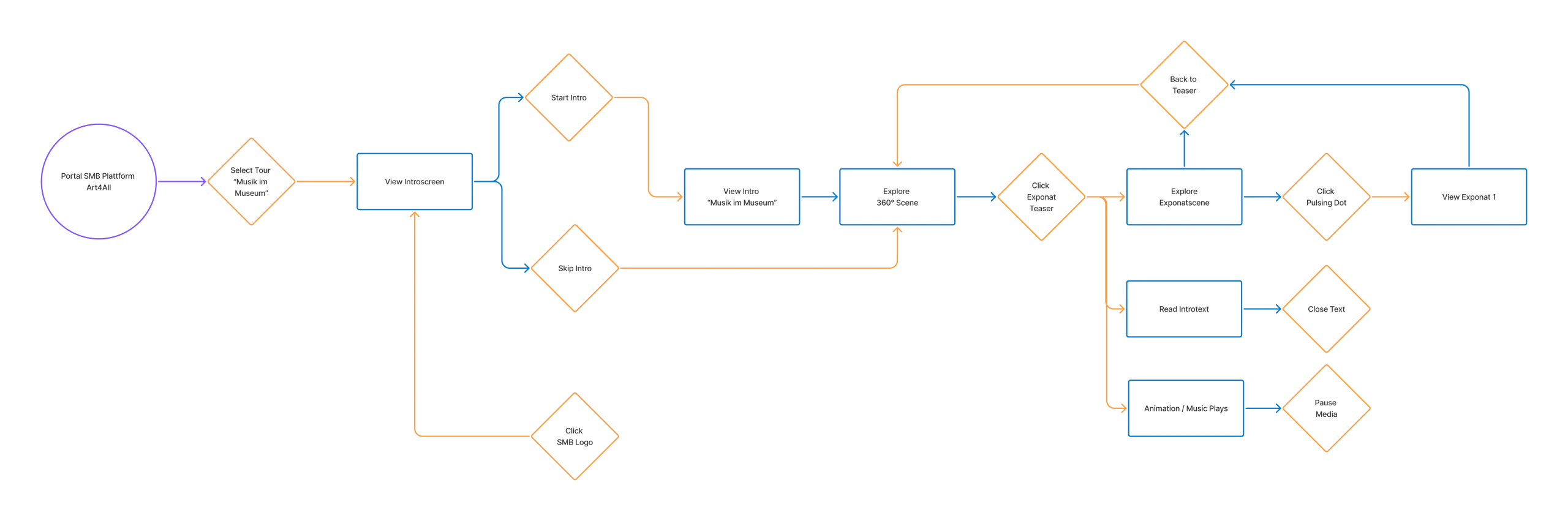
The visual character of the tour is defined by the illustrations and the museum’s CI. My role was the UX/UI design: the interaction model, navigation structure, and interface elements that give the experience its structure and logic.
The interface had to coexist with the illustration without competing with it. Entry points are marked subtly — visible enough to signal hidden content, restrained enough not to overpower the visual environment. Interactive elements within the artefact scene are indicated through pulsing dots and media player icons, keeping the UI minimal while remaining informative.
The navigation bar is anchored at the bottom of the screen with a deliberately organic, non-strict border — a structural element that acknowledges the illustrative nature of the environment rather than imposing a rigid interface logic on top of it.
Text legibility in a 360° environment required a specific decision: text fields are displayed in 2D, without perspective distortion, keeping content readable regardless of the viewer’s position in the space. A short introduction text opens automatically upon entering each artefact scene — orienting the visitor and hinting at how many artefacts are waiting to be discovered.
Each tour opens with a short animated teaser — setting the tone and establishing the visual language before the experience begins.
04 — Reflection
In Retrospect
The blueprint proved durable — the concept and interaction model were adopted for three further tours, with only minor modifications. Ambient sound, one of the directions I would have liked to explore further, was picked up in a later tour.
The most persistent challenge of the 360° format was visibility: how does a visitor know what exists outside the current frame? The solution was motion — a subtle shift of the scene in the direction of movement, encouraging exploration rather than directing it. In retrospect, a small visual hint at the start of the tour might have helped orient first-time visitors before the exploratory logic became intuitive.
Looking back, there are directions worth pursuing further. The 3D possibilities of the format remain underexplored — foreground and background could be used more deliberately to create depth and layering. And visual entry points beyond text and headlines deserve testing: are there more intuitive or surprising ways to signal the artefact scenes?