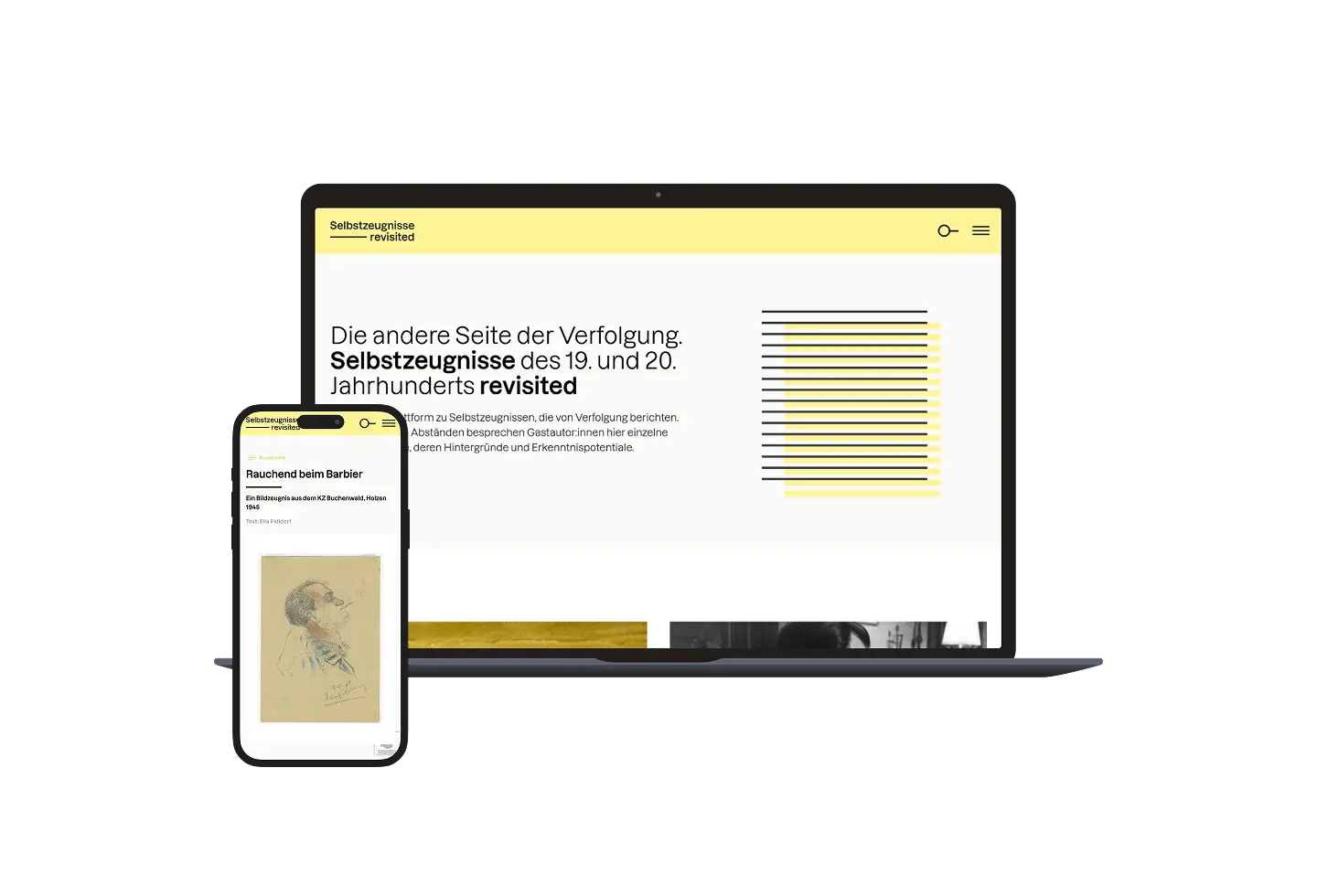
Web Design for a Historical Archive Platform — Selbstzeugnisse Revisited
Project Type
Digital Archive / Research Plattform
Client
Humboldt University of Berlin
Year
2022
Role
UX/UI Design, Webdevelopment
Selbstzeugnisse Revisited is a digital platform presenting historical testimonies of persecution in their scholarly context. Each entry pairs a primary source with an academic essay exploring its research potential. The design challenge was to make this text-heavy, layered content visually accessible without compromising academic rigour.
01 — Challenge
Designing the Invisible Frame
The platform’s content set strict terms for the design: historically significant, emotionally charged testimonies demanded a visual tone that was careful and considered. Academic standards for citation and source attribution had to be met without making the experience feel dry or inaccessible.
The imagery constraint sharpened the challenge further. With only a single archival document per entry — a photograph, a handwritten letter, a diary page — there was no visual material to fall back on. No photography, no illustration, no decoration. The design had to generate its own visual language: one that could carry the weight of the content without competing with it.
02 — Approach
Structure as Empathy
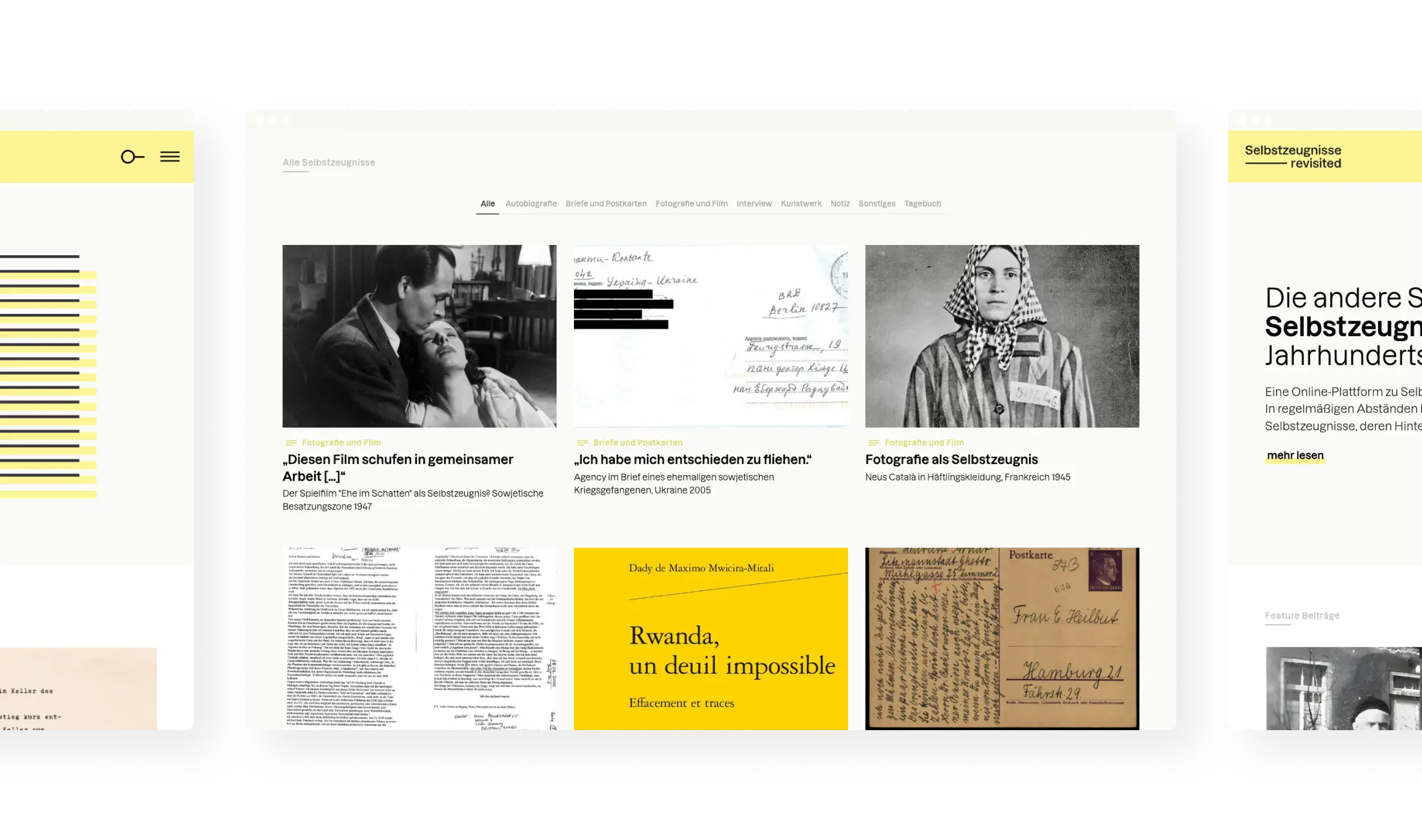
The design takes a deliberately minimal approach, letting typography and structure carry the experience rather than visual complexity. A clear hierarchy and restrained styling create space for the source material — guiding readers through dense, layered content without adding visual noise.
Subtle highlight colors distinguish between primary testimony and supporting scholarly context, providing orientation without decoration. A filter system allows users to explore the collection by type of persecution, medium, location, and historical period — making an emotionally charged archive feel navigable and approachable.
03 — Visual Identity
The Document as Form
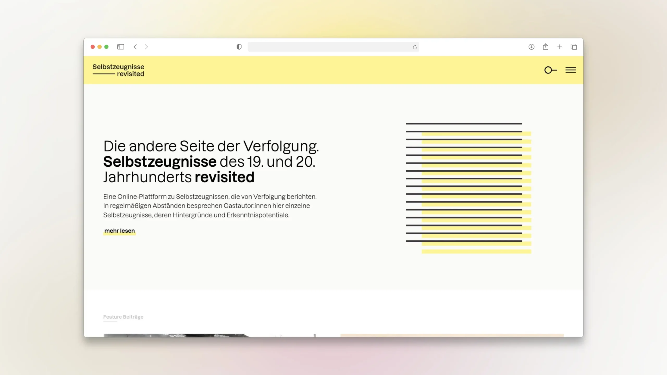
The signet is built from horizontal lines — dense, layered, slightly shifting — evoking stacked documents and accumulated records. It references the act of archiving itself: material gathered over time, stored in layers. The wordmark uses Lazzer, extended by a single horizontal line as a quiet typographic gesture that echoes the signet and reinforces the document as a foundational visual form.
The color palette follows the same logic of restraint. Bright, saturated colors would have competed with the content — or worse, felt inappropriate for the subject matter. Instead, a pastel yellow references aged paper and archival material, paired with mint and dark charcoal. Color is present, but never loud — expressive enough to give the platform character, restrained enough to stay in the background.


04 — Reflection
In Retrospect
The Hintergründe section was conceived as a counterpart to the primary testimonies — two sides of the same inquiry. In practice, less content was created for this section than originally anticipated, which means its current design — a grid with imagery mirroring the primary entries — gives it more visual weight than its content warrants. A more restrained treatment would better reflect its supporting role.
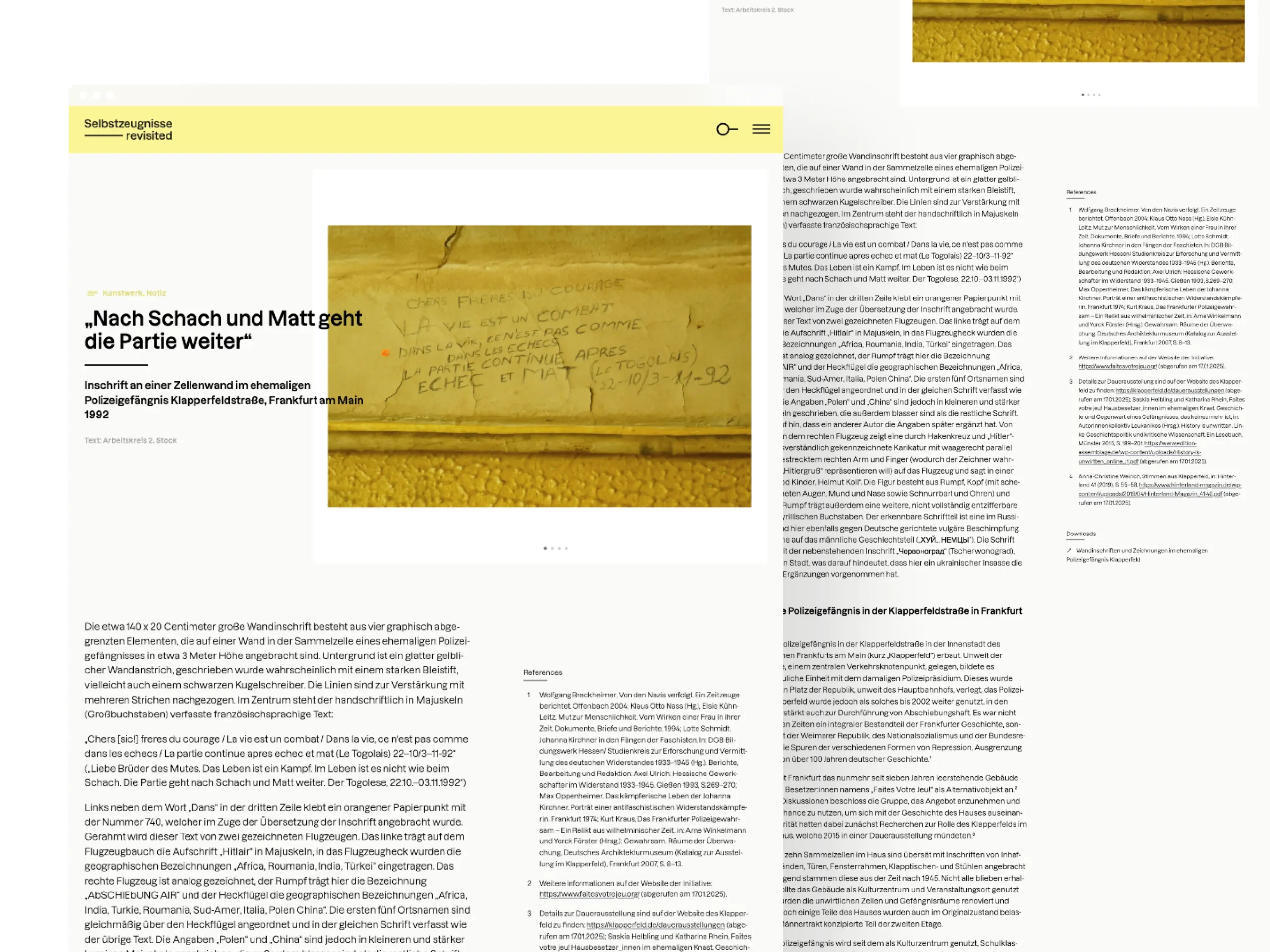
The relationship between source text and citation could also involve a stronger solution. Currently, text and citations sit in fixed columns — as you scroll, the connection between them is lost. A floating citation column or interactive reference numbers that reveal the source inline on hover or click would make the relationship between document and commentary more tangible. Budget constraints shaped what was achievable here — but it remains a direction worth pursuing.