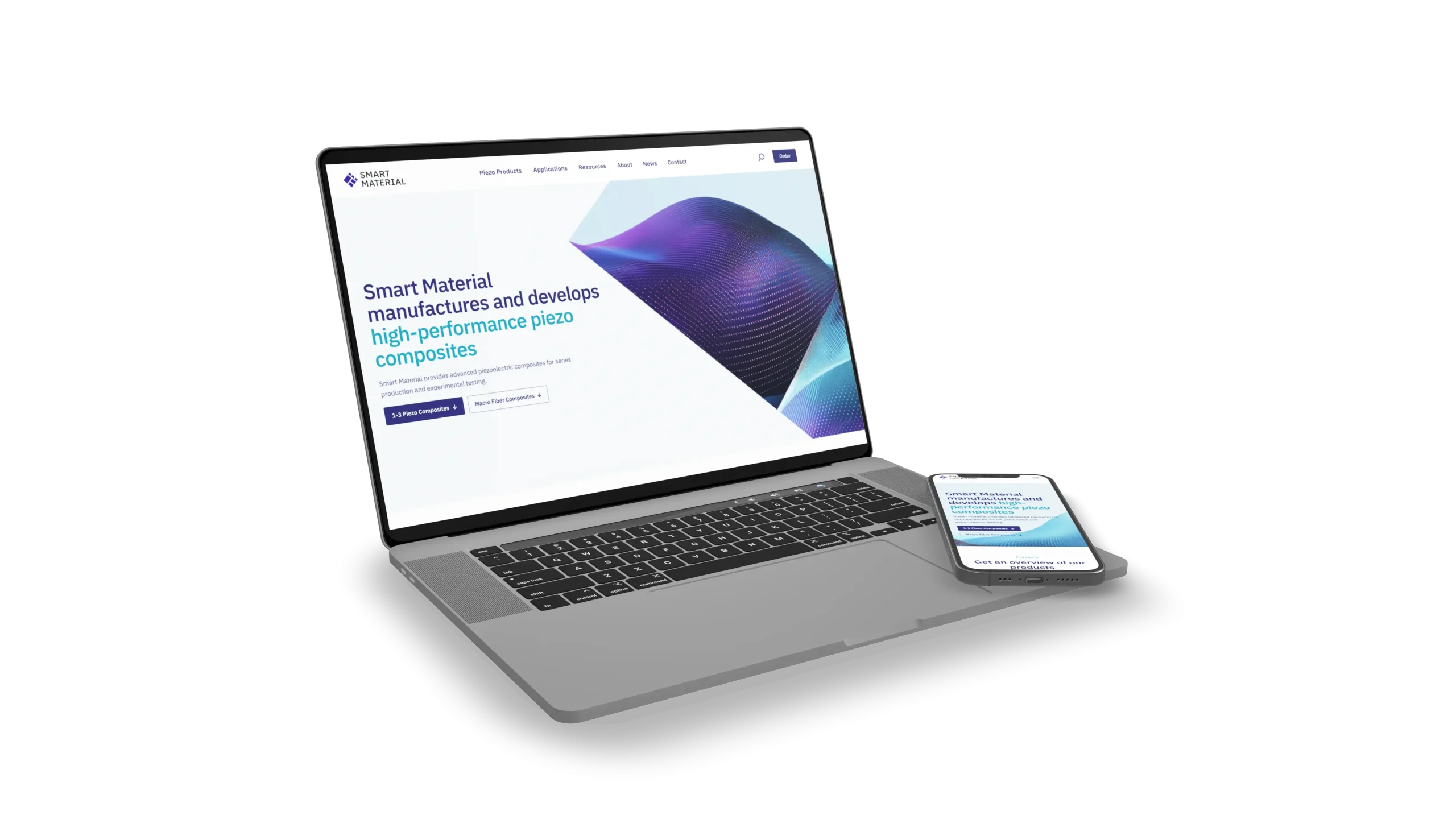
Designing for Expertise —Website Relaunch for a High-Precision B2B Brand

Project Type
Website Relaunch, UX/UI Design
Client
Smart Material Corp.
Year
2025
Role
UX/UI Design and Webdevelopment
Smart Material Corp. manufactures advanced piezoceramic composites for aerospace, robotics, and research. The relaunch set out to make a highly specialised product range accessible to a diverse audience — while building a visual brand presence that matched the sophistication of the products themselves.
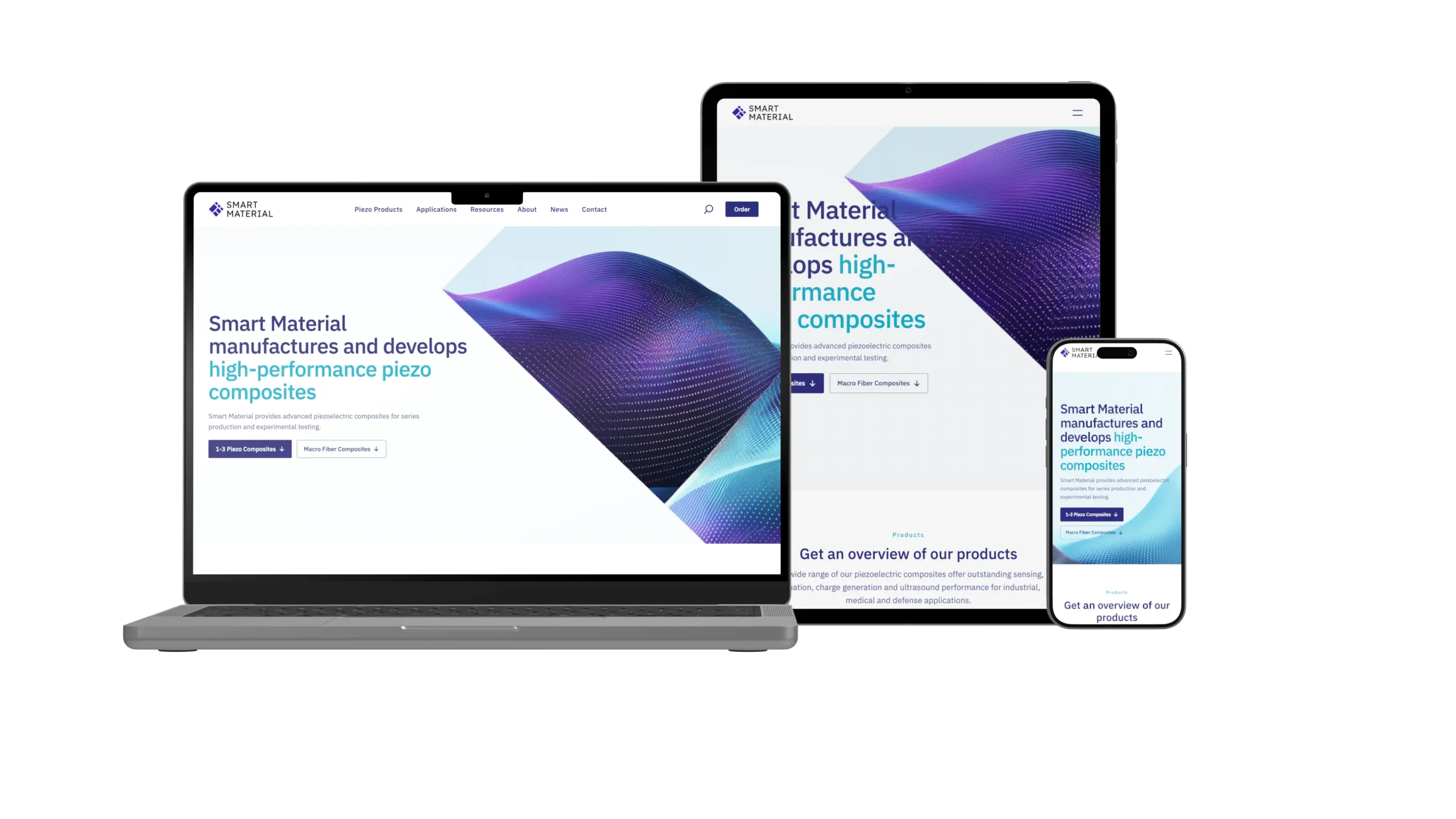
01 — Challenge
Structural Challenges Before Visual Ones
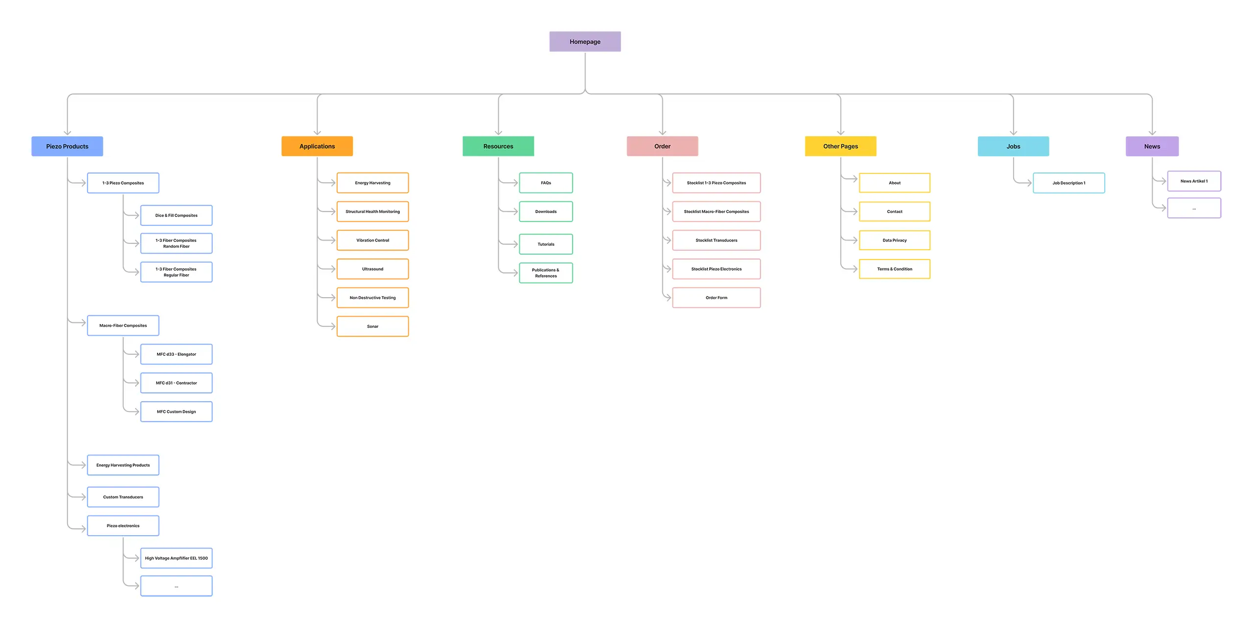
Smart Material’s existing website no longer reflected the sophistication of their products or the diversity of their audience. Navigation was complex, mobile was an afterthought, and the visual language no longer matched their market ambitions.
The core challenge was structural: a highly specialised product range needed to be accessible to a diverse audience — from engineers and procurement professionals to researchers and first-time visitors — through a single interface. A standard e-commerce approach was unsuitable from the start: every order requires a compliance check, making direct purchase impossible.
Brand assets were nearly absent. An updated logo and a color direction — blue and purple — were the starting point. Beyond product photography and a few technical drawings, no imagery, CI, or visual system existed. A coherent visual language had to be built from almost nothing.
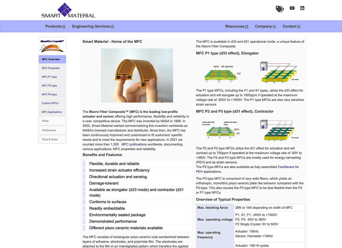
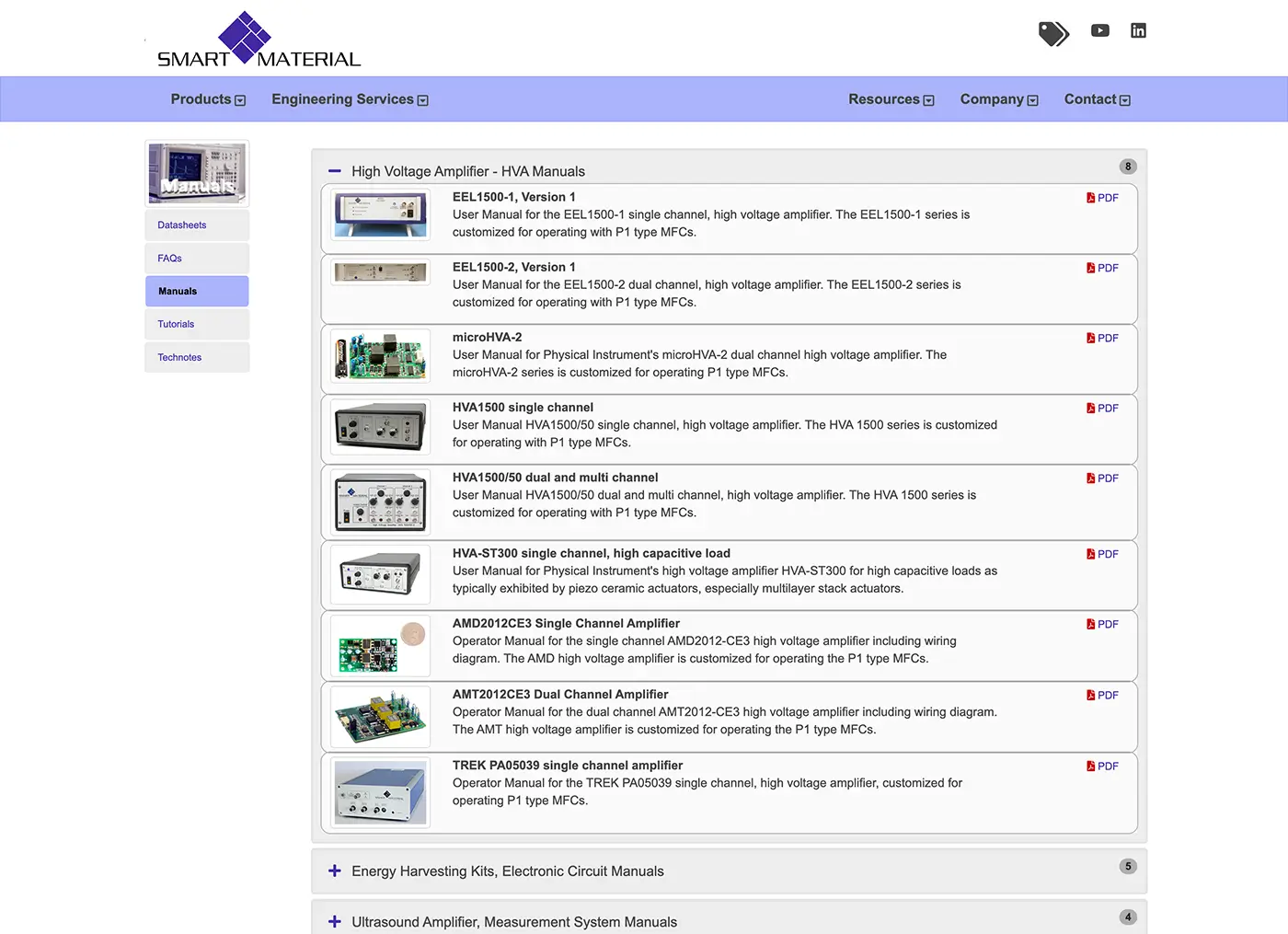
Previous Website
02 — Approach
Bringing Order to Complexity
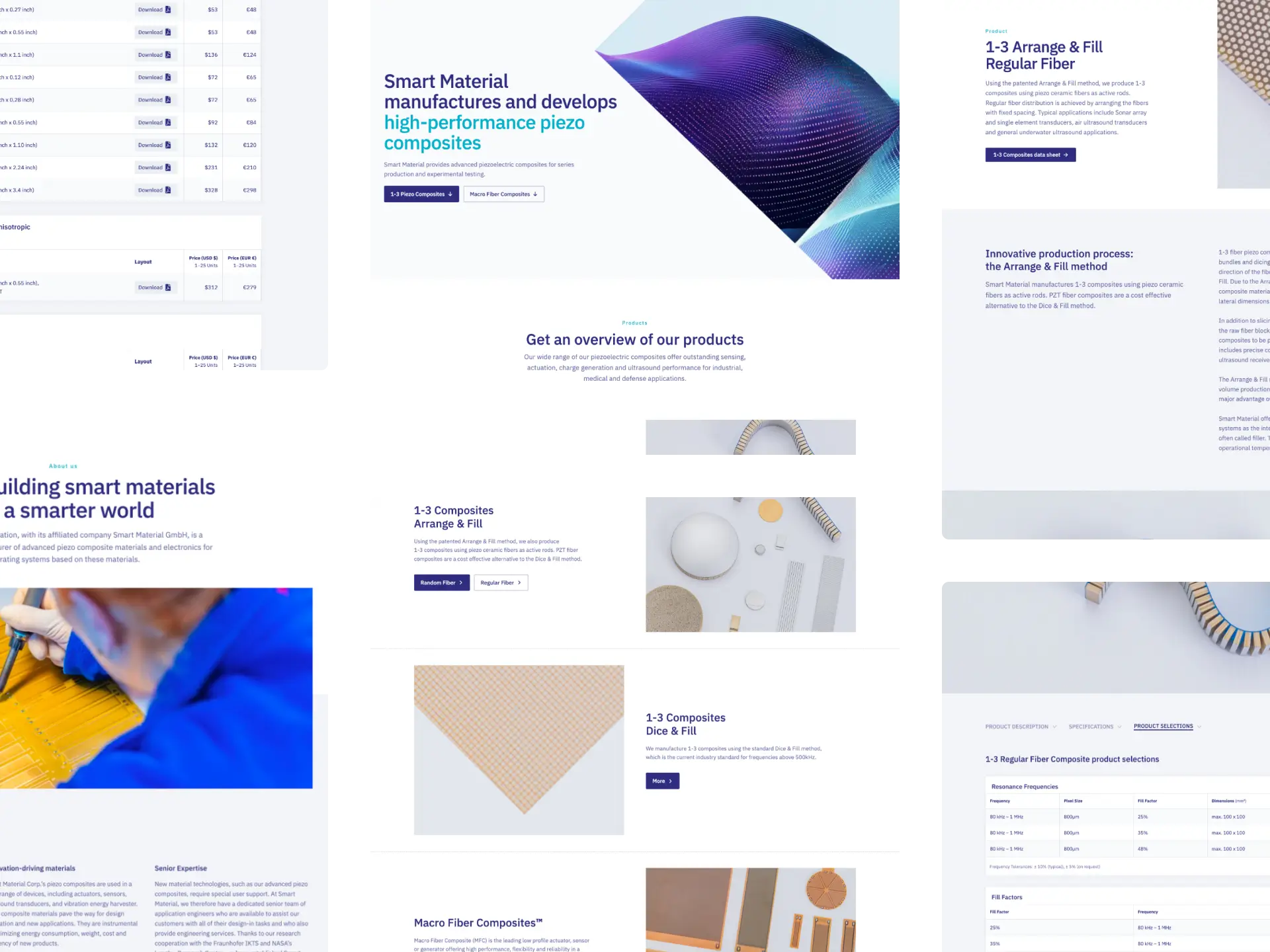
Restructuring the information architecture was the first priority — regrouping products into clearer categories, and introducing a visual mega menu that allows fast orientation without prior product knowledge. A new Applications section was developed to bridge the gap between technical specification and real-world use, making the product potential tangible for less technical visitors.
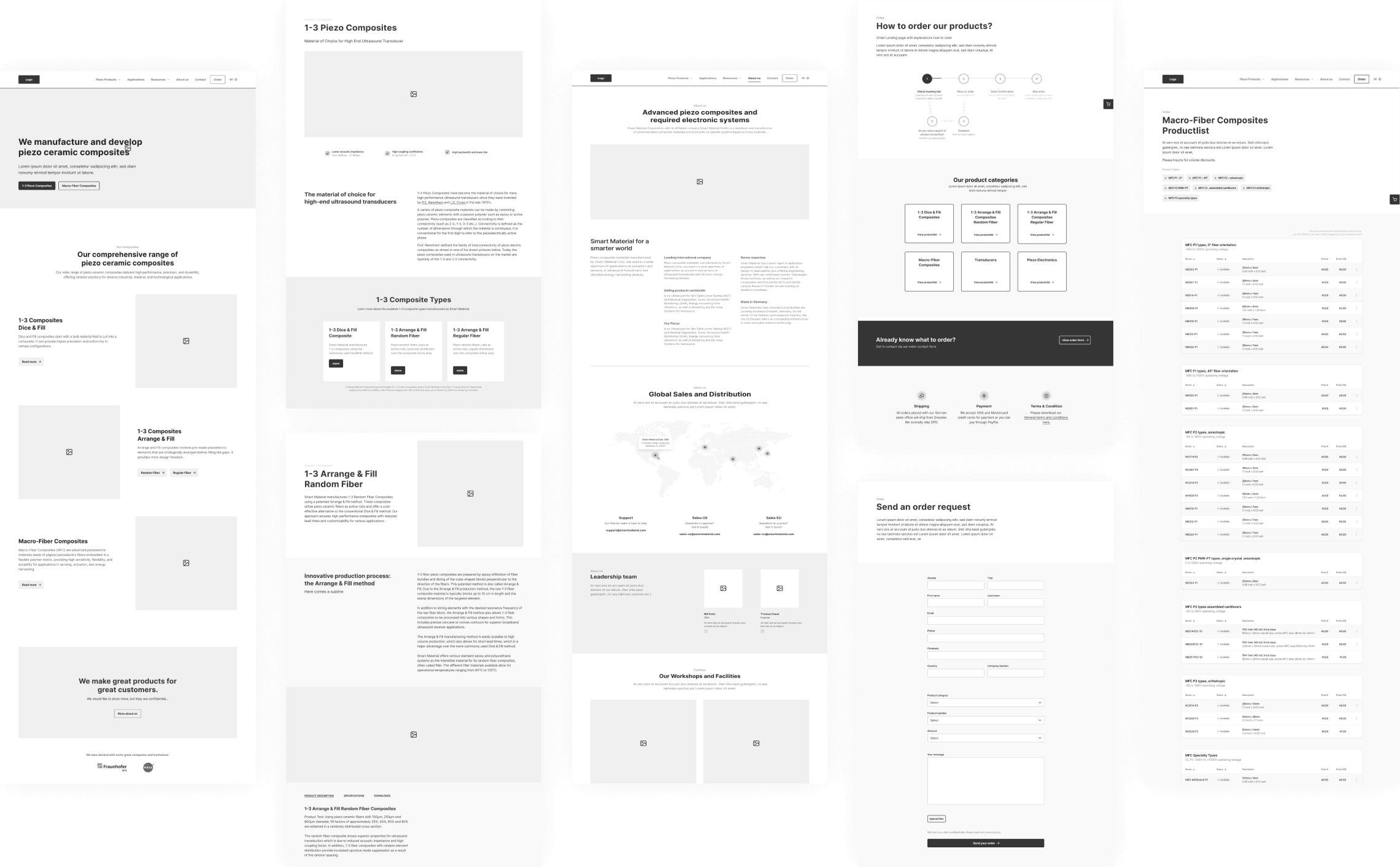
Product pages were rebuilt around consistent parameter presentation, tab-based organisation for technical details, and dedicated sections for data sheets and downloads. Table layouts were redesigned for legibility — improved contrast, clearer hierarchy, and consistent formatting across the product range.
03 — Visual Identity
From Color to Visual Identity
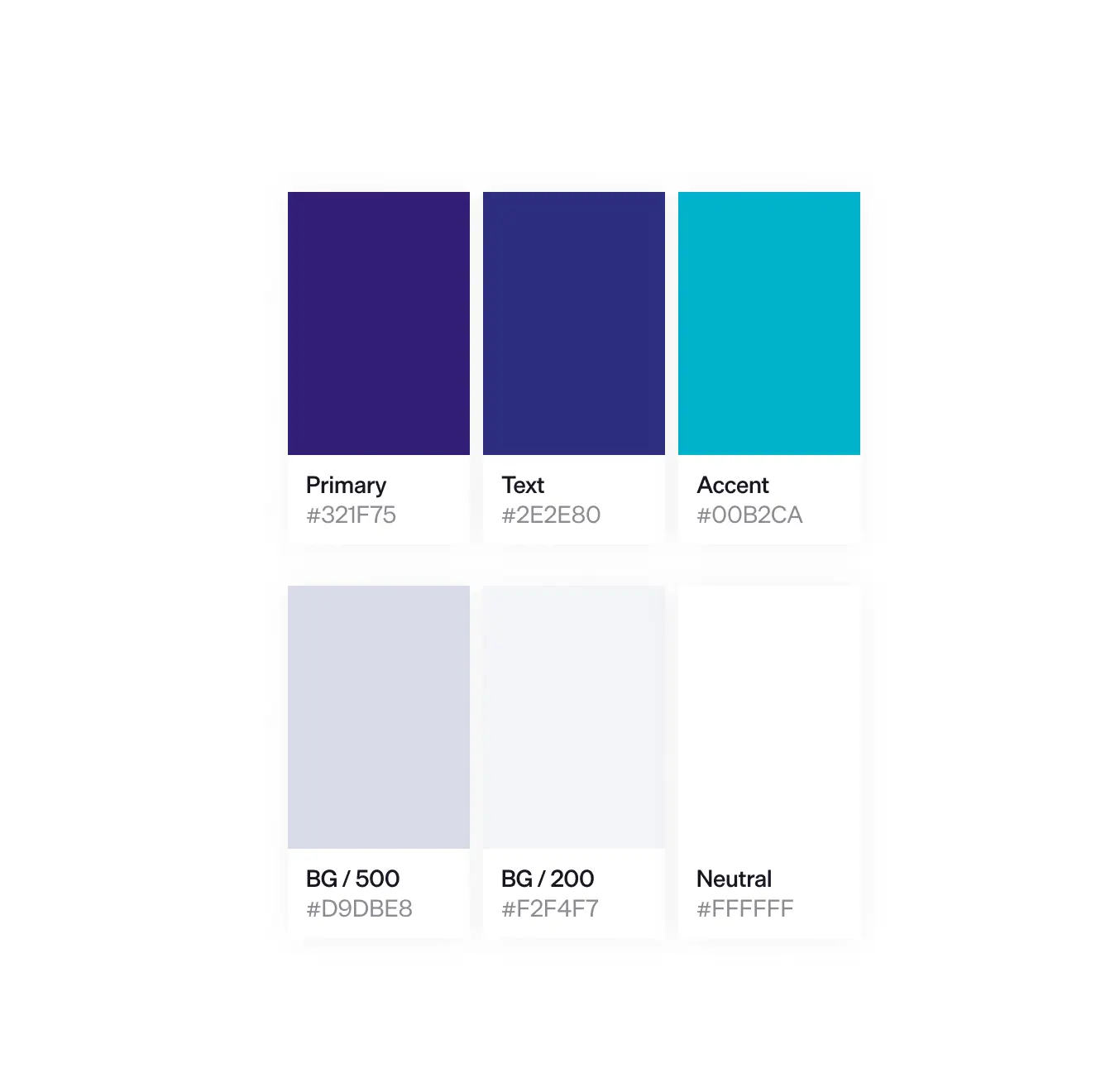
The project provided a logo and a color direction — blue and purple. Developing a coherent visual language beyond that was not required, but became a deliberate design decision — driven by the goal of creating a recognisable presence in a competitive market.
The key visual concept — fibers in motion, flowing forms, a sense of material precision and advanced technology — was developed through ideation and iteration, and realised using AI image generation. The resulting visuals foreground the material qualities of the products themselves, giving the brand a distinctive layer without misrepresenting what the products look like.
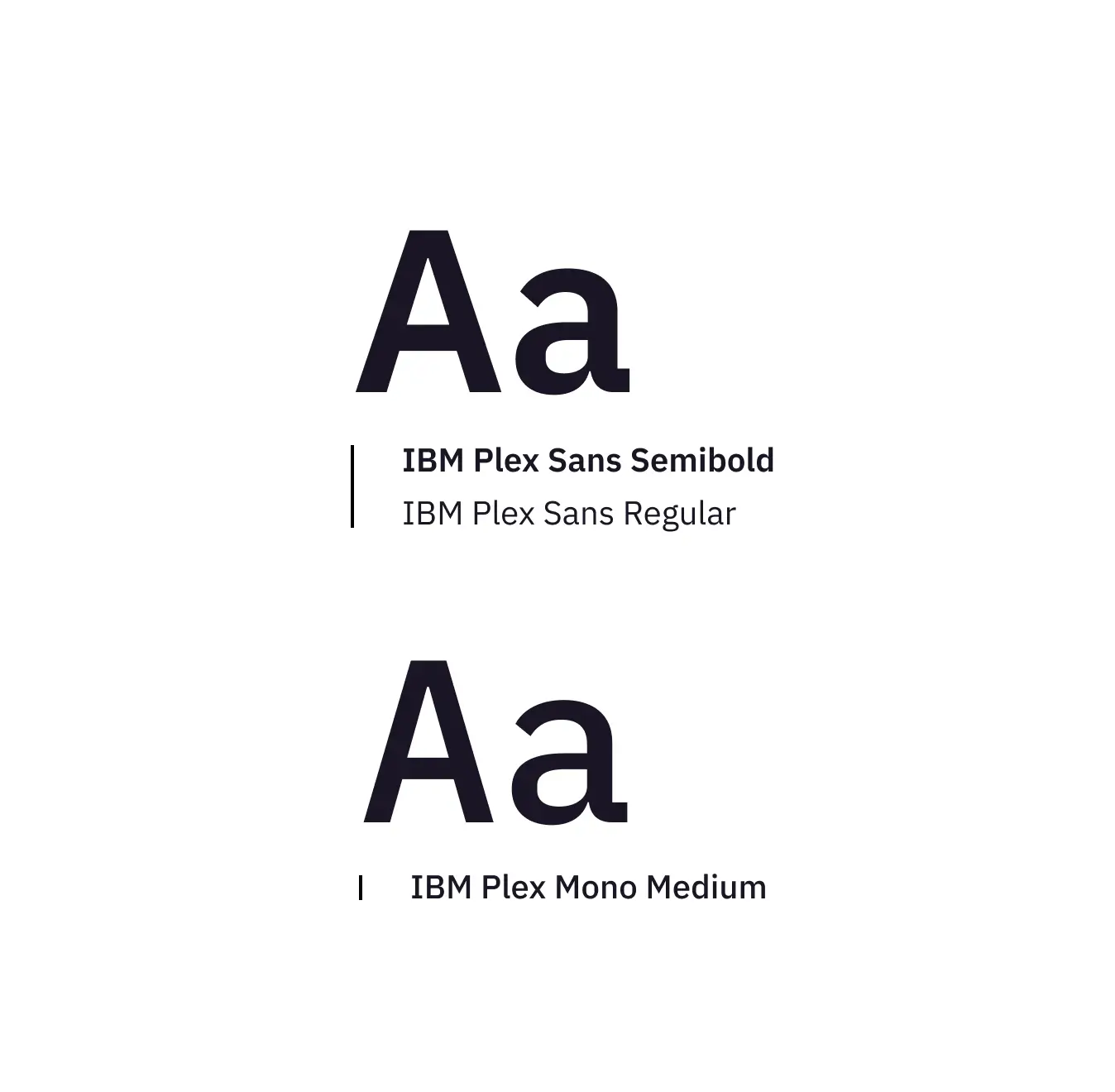
What started as a website visual language has since been adopted more broadly. The key visuals, typography, and color system now extend into the client’s offline communication as well, giving the brand a consistent presence across contexts.



04 — Reflection
In Retrospect
The relaunch was received positively across the client’s customer base. Brand visibility improved, and the new Applications section opened the product range to a wider audience. The site is currently being extended with multilingual support.
The hardest design problems on this project weren’t visual — they were structural. Every significant decision was an answer to a constraint: a diverse audience, no standard shop function, a product range of considerable complexity, and almost no brand assets to build from.
Making technical complexity navigable. The mega menu was restructured around a hierarchy developed with the client — primary product groups prominently featured, secondary groups receding into a side column. The Applications section connects specifications to real-world use, making the product range tangible for less technical visitors.
Solving the ordering problem. Without a standard shop function, the ordering process needed to be communicated proactively. A persistent Order button combined with a visual „How to Order“ schematic makes the process transparent from the first visit — accommodating both fixed-price products and those requiring individual consultation.
From information to communication. The most consistent change across the site was the shift from technical labeling to active, human language. Headers became communicative, calls to action were integrated throughout. For a highly specialised B2B product, this shift made the site feel approachable without sacrificing credibility.